Google Chrome has a new logo, which was recently rolled out with the latest developer builds of the browser. Behold, the dramatically modified icon that will soon grace your devices:

Whoops. I must’ve uploaded the wrong image. Let me try again. Enhance!
Hmm. *Types away at keyboard.* Okay, that is new-chrome-logo-2022.png.
For reference, this is old-chrome-logo-2014.png:

So yeah, it’s Chrome’s first new logo in eight years, but not that much has changed.
Not to say that’s a bad thing, really. The Chrome logo is pretty iconic, and everyone knows what it is. Google probably doesn’t want people to panic when they suddenly can’t find their browser because of some newfangled logo. Instead, the new logo will probably just give some people that weird “hmm, something’s different” feeling, like when Spotify changed its shade of green and people revolted, presumably including Neil Young.
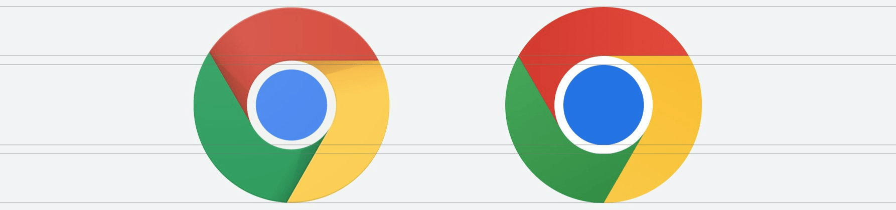
Now’s your last chance: can you spot the differences?
…
Okay, time’s up. Here’s what’s officially changed, according to Google designer Elvin Hu.
- The icon has been simplified/flattened by removing the shadows.
- The colors are brighter, making that fancy screen of yours pop.
- The proportions are different, making the big blue ball in the middle noticeably bigger.
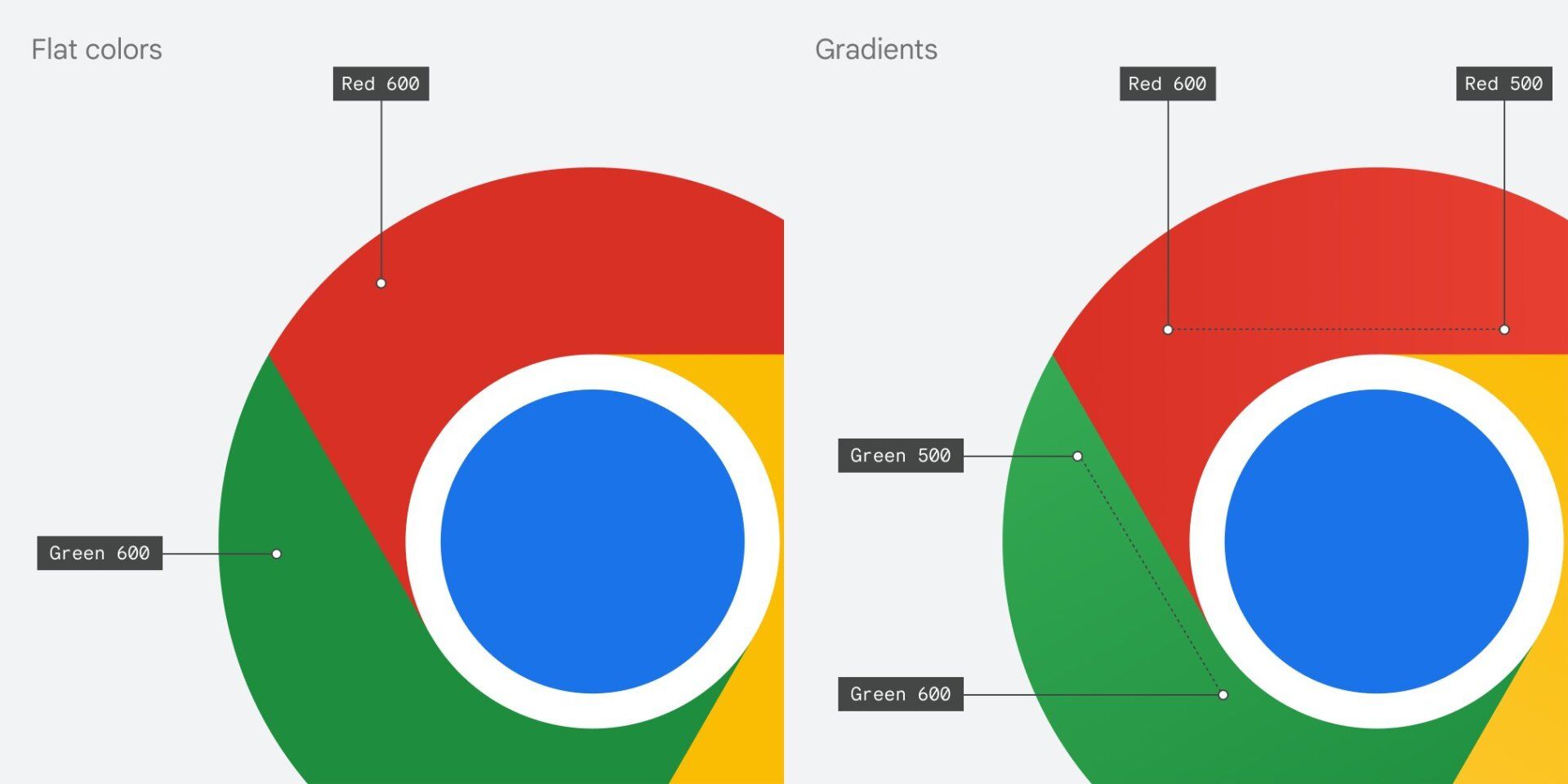
- There’s a slight gradient on the colors because “placing certain shades of green and red next to each other created an unpleasant color vibration.”
Design is about the details, after all. But wait, there’s more!
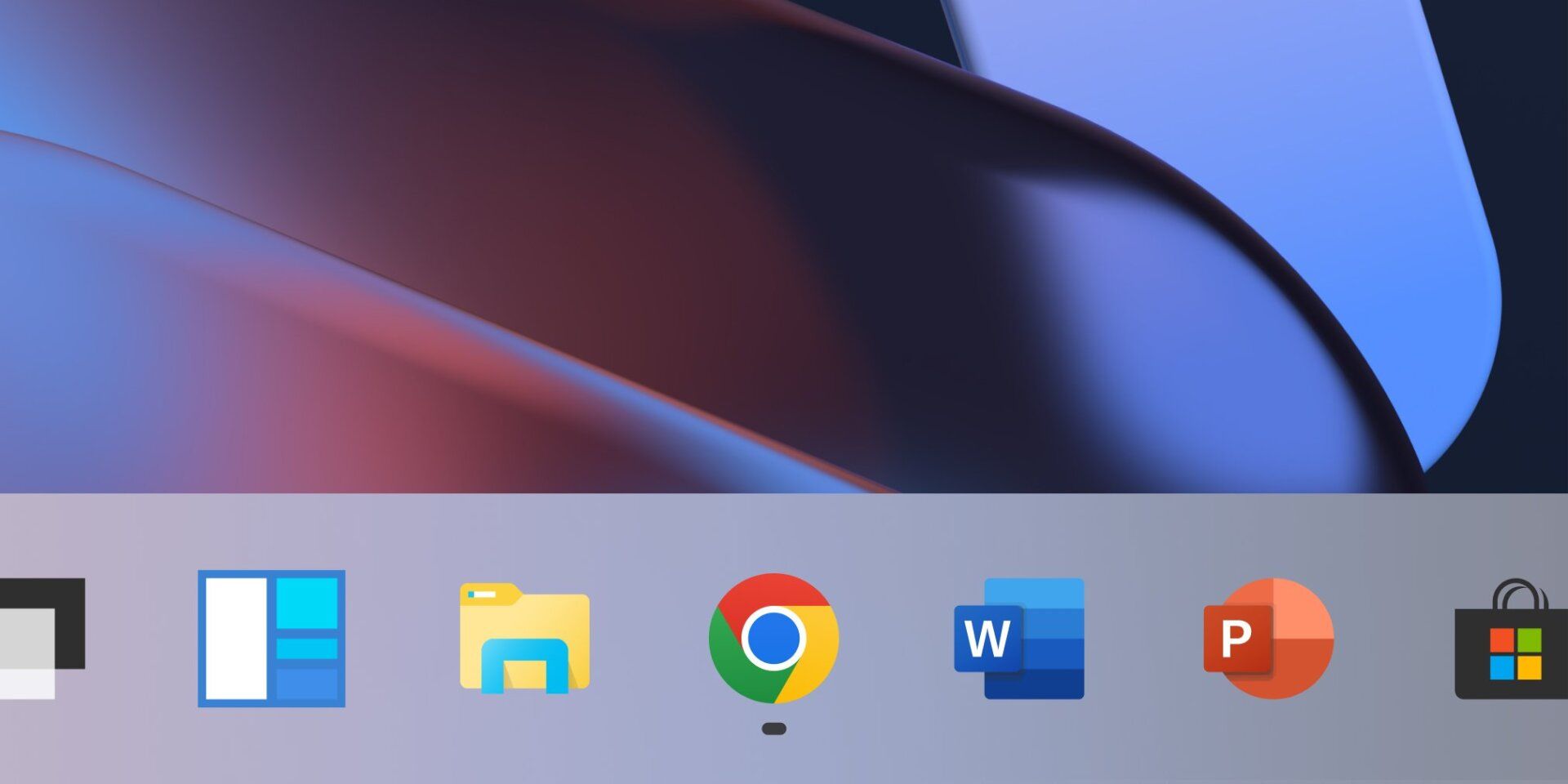
Google is actually making the logo subtly different for various platforms in order to better blend with their individual aesthetics. Per Hu, on Windows 11, the logo has a more graduated look to match the OS’ aesthetic.
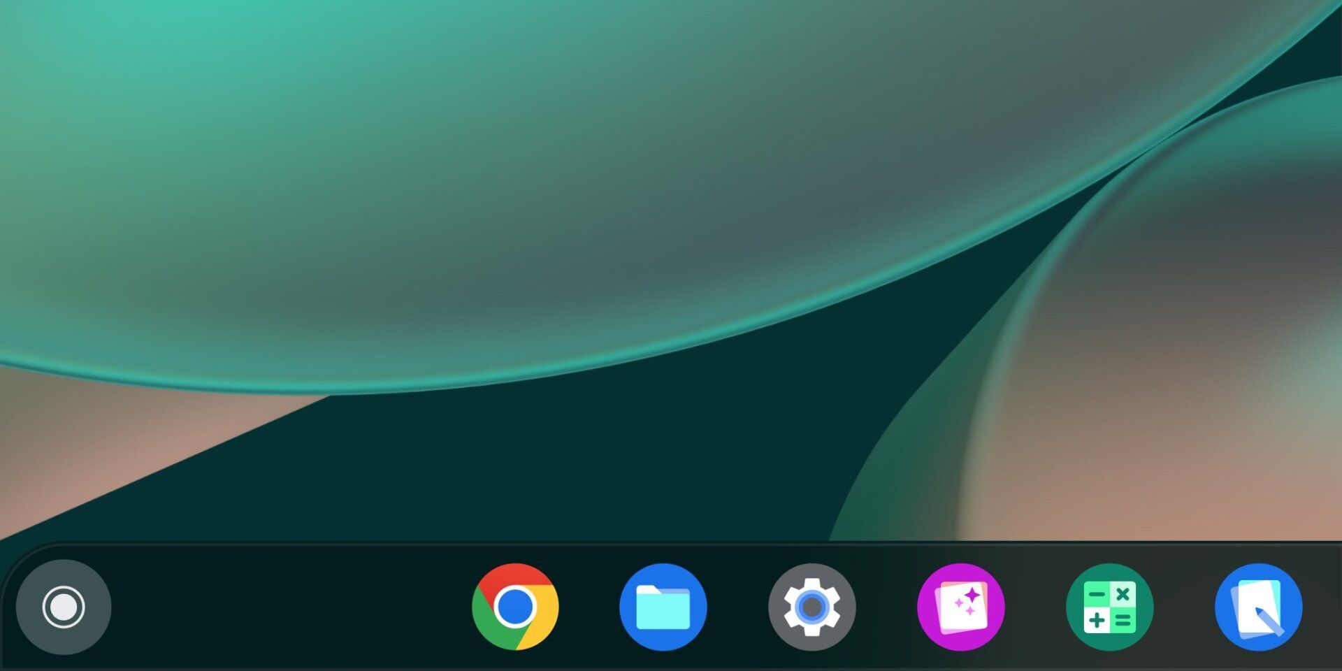
But on Chrome OS, the colors are more solid, because that’s the way Google’s design leans these days.
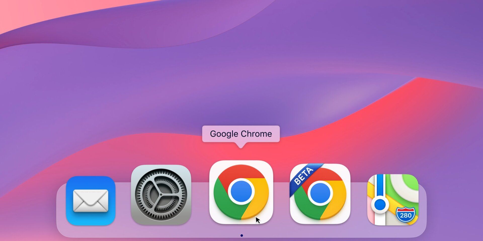
Meanwhile, the Mac version comes out of left field with a slightly 3D icon that somewhat matches native Apple icons.
On the whole, it’s a change that most people won’t notice, and that’s probably just fine. That said, part of me wishes Google had gone bonkers and made an altogether new logo (Google apparently considered bigger changes but decided against them). I mean what if the Chrome logo was actually, you know chrome ? Now that’s a bright and shiny idea.
Some of you might have noticed a new icon in Chrome’s Canary update today. Yes! we’re refreshing Chrome’s brand icons for the first time in 8 years. The new icons will start to appear across your devices soon. pic.twitter.com/aaaRRzFLI1
— Elvin
(@elvin_not_11) February 4, 2022
The new logo will be rolling out across various platforms ‘soon.’ If you want to read more about what’s new, I recommend reading Hu’s Twitter thread detailing the changes here.